Posts

How to choose the perfect heading size and text size in web design typography

Image
This is the best thing I've come across for some time - a logical/technical way to pick font sizes in relation to each other. Read on and if you have time, watch the video as Tim Brown gives his explanation (30mins). Essentially this technique is built around using a harmonious modular scale (using the Golden Ratio or any other "beautiful" scale) and applying it to text size (so simple I can't believe I haven't run into this before!!) Once you have settled on a suitable type size for the body text you can use the Golden Ratio to find a modular scale of headings and smaller fonts sizes that are visually in proportion, for example: Golden ratio = 1:1.618 Text size = 16px 16 x 1.618 = 25.888 16 / 1.618 = 9.888 This produces a pixel scale: 41.9, 25.9, 16, 9.9, 6.1 You can also "reverse engineer" an element box width to find the appropriate text/heading size, for example if you have a column of 570px (like this one) then divided by the G...

How to convert Pixel to Em - Why use ems for font size?

Image
Following on from the last post about calculating beautifully proportioned text sizes, I thought it would be good to cover the "correct" unit of text measurement rather than just sticking with pixels. The W3C recommends that you use ems for font sizes - why? The "em" unit is the most scalable when it comes to on-screen display (read more from  W3C here ) Basically it gives users the ability to scale up all the font in a web page using their browser settings and see them "grow" proportionally. This is for accessibility reasons. Generally when you are in the design phase using pixels sizes is easier - so in the end you'll need to convert from pixels to ems. So how to convert pixels to ems? Most browsers have a default font size for "medium" text of 16px. In this case 1em = 16px. So if you want a font size of 20px you need to divide 20 by 16 which equals 1.25em - easy. You can use the following widget to calculate em sizes. Another trick...

How important are images, photos and info-graphics in web content?

Image
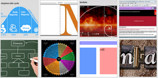
For most web pages and blogs "content is king" (Bill Gates c. 1996) and in addition to text, content should include images, photos and infographics. I would go so far as to say that images/graphics are even more important now than they were 12 months ago. Just look at the new web apps and design views that are turning up. Thumbnails are the  plat du jour  - mobile phone apps and tablet layouts are navigated using images and thumbnails. So to have an appropriate image or graphic for each web page or article is essential. graphic thumbnails from the web devil blog Great looking graphics will also attract viewers and keep them coming back for more visual feasts. The last thing people want is to wade through paragraphs of text without a visual break. And as the famous saying goes " a picture says a thousand words ". Other benefits of images are in searchability. The number of image searches (google images, flickr etc.) is increasing substantially and relevant...

Mobile web design viewport size vs screen resolution - viewport META tag

Image
In a previous post I mentioned the various screen resolutions of popular mobile phones. Today I'll mention how the screen size and viewport may be different! So, what is a viewport? The viewport for web design is defined as the rectangular area (measured in pixels) that is viewable on the screen and determines how the content is laid out and where text wraps or windows need to be scrolled to see the full webpage. Isn't the viewport the same as the screen resolution? For most devices the screen resolution/display size is equal to the viewport. This is true of desktop and laptop computers, however  for mobile devices this may not be true !! Many phone browsers scale web pages down to a wider viewport width to fit them onto the screen. This is sometimes called overview mode. These browsers allow the user to zoom in and scale the pages up to view the bit they want to see. For example, although a device screen might have a width of 320px the viewport can have a width of 980p...

How to make a good infographic

Image
Infographics or information graphics are visual representation of data and are a great way to explain complex information in a clear graphical way. These usually take the form of maps, charts and diagrams that are both interesting and appealing. There is a great article over at  submitinfographics.com  that looks into the eight factors that make a good infographic. I've summarised Amy's work into the following points and a simple infographic (that breaks some of these "rules" - click image to enlarge) 1. Data Visualisation Must be data driven - not just fancy looking text (think chart, map etc.) 2. Clean Colour Pallet Must compliment the website, colour must be significant - no MS Paint style colour pallets. 3. Clear Story Should tell a story with pictures - and contain more than one piece of information (good infographics weave different facts and data together). 4. Dimensions Don't make the infographic too big. It has to fit on the average viewers monito...

How to make multiple div columns expand to the height of the tallest/highest column - 7 solutions

Image
I've tried to include a comprehenisve list of all solutions to this common problem. It is one of those web design problems that every web designer runs into eventually. You have two or more columns that have auto height (so it expands to the content) but you want to have both columns take the height of the tallest one. You may become frustrated and just go for a fixed height on both columns - but this isn't really a solution. There are basically 7 work-arounds for this problem which I will briefly note and reference other sites that show the solution in more depth. 1. The Faux Columns method This as the name suggests uses false columns in the way of tiled background images to create the illusion of similar sized columns - this is a bit of a cheat (and uses extra images). Not really recommended as every time you change column widths you need to make a new image.  www.alistapart.com/articles/fauxcolumns/ 2. The Overflow Crop method This method uses overflow:hidden CSS and...

What is Web Accessibility? How to make web pages accessible.

Image
Web accessibility is making multimedia and web content accessible to people with disabilities. The following infographic gives a short summary (click to enlarge) Accessibility aims to address the following: Visual impairments including blindness, poor eyesight, colour blindness Motor/Mobility: difficulty or inability to use the hands, including tremors, muscle slowness, loss of fine muscle control Deafness or hearing impairments Seizures caused by visual strobe or flashing effects Designing for Accessibility The W3C (world wide web consortium) provides guidelines to help developers of web and multimedia to create accessible material.  www.w3.org/TR/WCAG10/#Guidelineswww.adobe.com/accessibility/ Accessibility Guidelines The following are 4 key guidelines that apply to multimedia design: 1. Provide equivalent alternatives to auditory and visual content Use the image ALT attribute Make pages that are screen reader friendly Give videos subtitles 2. Don't rely on colo...

Multimedia sounds - a review of online sound libraries

Image
Sound is important to multimedia and application development - however the era of sound in websites has thankfully passed (don't you just hate landing on a website to be greeted with a blast from your speakers!) Finding the right sound - and a sound that you can use commercially without infringing on copyright laws can be a challenge which is why I've put together a list of the best multimedia sound resources on the web. Here is a quick review of current online sound libraries: freesound.org Free sounds released under the Creative Commons Sampling Plus License. Good for recorded environmental sounds. You need to have an account to download.  100,000+ sounds soundsnap.com Insane number of sound effects and music loops.  Used to be free - now it's  a pay-per-sound library.  You can still preview all sounds without logging in. This is the premier sound library on the internet (if you're willing to pay a few $$). 120,000 + sounds soundbible.com Free sound...

How to optimise your eBook cover for black and white E Ink kindle eBook readers

Image
This is a follow-up to the last post which was about t he size an eBook cover should be .  I'll quickly outline how to optimise a colour eBook cover so that it looks good when viewed on E Ink devices and on colour devices. As discussed previously, currently an eBook cover should tick all the following boxes: 600 x 800 pixel size title, author readable at small sizes  colour looks good for pc & tablet viewing also looks good on E Ink devices in grayscale The last point is really important and means that you need to create your eBook cover to work both in colour and in grayscale. Here's a quick tip using photoshop to quickly flick back and forth between grayscale and colour so that you can make it look good in both. Firstly scale your image to the correct size (600x800) then in the layers panel add a new adjustment layer by clicking on the little circle icon (Step 1 in the graphic).  Choose the Black and White adjustment layer (Step 2) - and just...

How to write great content for your website

Image
There is a great article over at  smashing magazine about the copywriting errors  that can ruin a company website - these points along with using content templates, writing great H2 heading tags and using appropriate images and infographics will ensure great content for the website you're designing. Let's start with those copywriting errors: 1. Focus on the reader NOT the company What's in it for the reader how will it benefit them and give them a better experience?  They don't want to know about how cool the company is. The article has some useful links to  setting a word budget  to promote a product or service. 2. Put the message up front The average web visitor scans a page to find what they are looking for and will move on if it's not obvious.  (check out  the dominant reading pattern of a web page here ) So put the main message up front and obvious.  Check out  this post about how to write good H2 titles . 3. Make meta data work ...

How to write a call to action button - an online call to action tool

Image
A call to action button entices your viewers to click to do more than just read.  This can be anything from  Buy  to  Try  to  View  and anything inbetween. What is it that you want your viewers to do? Writing a compelling  Call to Action  will help your conversions. One tried and tested method is to have an  Action  (order or command) followed by the  Product Name  (optional) with a  Timeframe  (for a sense of urgency) and then a  Tagline  (sometimes located outside the button). The following simple form allows you to pick some common variations to come up with a unique call to action phrase that fits your product or service. Web Devil Call to Action Generator:     ..choose an action     Order     Buy     Add to basket     Get it     Buy your tickets     Purchase     Add to wishlist     Schedule a con...

How readable is my website? Test how easy it is to read

Image
You want your readers to be able to quickly scan your web page and pick out the information they are after. But how easy is it to read your website? What we need is reliable readability tests! Online readability tests are quick tools to measure your text.  Take a look at the following two sentences: "The afore mentioned web resource provides statistics on the ease of readability of documents." Gunning Fog index: 14.17 "This website is great for measuring how easy it is to read some text." Gunning Fog index: 5.60 ..both mean the same thing - but have vastly different reading levels.  The Gunning Fog index is just one measurement. It indicates the number of years of education needed to understand text on first reading. Obviously the second sentence would be understood quicker and by more people. Check out this online readability test  www.online-utility.org  - just cut and paste the text.  It has a number of different methods of analysing your text ...

What is a crossdomain.xml file?

Image
A crossdomain.xml file is a file that usually sits in the root folder of your webserver.  This file is basically an opt-in to allow access to your data from outside your web domain.  This is the crossdomain bit - you have to actively give permission for someone to "trespass". Many web applications require access to data from somewhere different than where the app file originates.  The crossdomain.xml file gives these web apps permission. Things that may require crossdomain.xml access: Flash SWF Flex Adobe pdf reader Silverlight Example of a crossdomain.xml file: This following example of a crossdomain file basically allows no access, it's the strictest policy.  <?xml version="1.0"?> <!DOCTYPE cross-domain-policy SYSTEM "http://www.adobe.com/xml/dtds/cross-domain-policy.dtd"> <cross-domain-policy>     <site-control permitted-cross-domain-policies="none"/> </cross-domain-policy> If you want to al...

Convert a picture into a plain text image

Image
Imagine you have a picture or logo that you want to represent in a plain text file - a readme.txt or humans.txt perhaps. There is no way you can insert an image file format (jpg or png) into these plain text files.. but you can try and represent them using a bunch of //##**$$ characters. This can be hard to create freehand - so what about an online tool that can help? Amazingly enough there is a website that does just this!  Check out  text-image.com

Kanban software HTML/JavaScript application

Image
This is a great personal kanban that runs in your browser using HTML/JavaScript written by the talented Greg Gigon. A Kanban is a scheduling system that can be used to schedule tasks generally using the simple three-bin system. I personally have four bins!!  Priority/Awaiting/In Progress/Finished. Alternative bins for web development are: Backlog/Selected/ Develop ongoing/Develop done/Deploy/Live This software version allows you to quickly add/change/delete and move tasks into the different bins. Get it for free from here: http://greggigon.github.io/my-personal-kanban/ Watch how it works here:  

How to comment on blogs for SEO exposure

Image
Blogs are a fertile ground to add comments and many allow links to be inserted as well.  This can lead unscrupulous "backlinkers" to use comments to create backlinks to their sites. As we all know, backlinks are one of the factors that search engine algorithms use to determine the rank of a page.  However, there are a number of things you should watch out for: 1) Make your comment related to the post. I see so many crap SEO comments on this blog.  They are just generic comments that could apply to any blog, and always followed by a link. These are obviously spam backlinks (which get deleted). If you're going to try to cultivate backlinks in this way, make the comment related to the post - add your thoughts on the subject or why the post was good or bad (ps. you don't have to go brown-nosing in your comments to get a backlink, nothing stimulates conversations more than some precise criticism) 2) Does the comment count? You may not realise it, but many websites ...

Content Management Systems - Concrete5

Image
Over the next couple of weeks I'll throw together a review of the various content management systems you can use for web development and hopefully find some good videos that give a brief intro into these CMS's. I thought I'd start with the Concrete5 CMS. Not as famous as other platforms (wordpress, drupal, joomla etc.) but a great base to build your web sites. Concrete5 is now open source but was originally built in 2003 for AdCouncil (an American non-profit organisation that distributes public service adverts on behalf of various sponsors including the US government). Unlike many other CMS platforms Concrete5 didn't start out as a blogging tool - this makes it great for building non-blog style websites (but you can add blog functionality using a free blog add-on). Some of the benefits of Concrete5: It's free You can rebrand and resell It's easy to take HTML/CSS designs and then add the CMS functionality There's a marketplace of Add-ons (blogs, w...

Content Management Systems - Nuggetz

Image
Okay, so let me start by saying that Nuggetz isn't a fully blown CMS like Wordpress or Concrete5, it's simple.. really really simple. It's like the first CMS I built in PHP (but looks nicer) that allows simple content management of static web pages. It's what you want if you have a web site with a few static pages and you want your client to be able to edit the contents.  It's so easy for content management you KNOW that whoever changes the content can't get confused. They can't bugger up the whole site by clicking on the wrong control panel - because there aren't any control panels.  They just login and edit the "nuggets" of information right inside the pages!!! The reason I've included this is that it could well be the solution you've been looking for - easy content management for a simple brochure style website. No bells, no whistles, no add-ons widgets or plugins. As it's so simple there aren't many videos about Nugg...

The best free web design ebooks to download

Image
Starting to learn web design? Need access to good reference books? Here are some of the best free web design ebooks you can find on the web right now: Build Your Own Website The Right Way Using HTML & CSS, 3rd Edition http://it-ebooks.info/book/962/ Learning Web Design, 3rd Edition A Beginner's Guide to (X)HTML, StyleSheets, and Web Graphics http://it-ebooks.info/book/308/ HTML5 Quick Learning Guide http://freehtml5templates.com/html5-quick-learning-guide/ Design Your Imagination http://www.lulu.com/gb/en/shop/webguru-india/design-your-imagination-free-web-design-ebook/ebook/product-4067431.html Build Your Own Database Driven Web Site Using PHP & MySQL, 4th Edition http://it-ebooks.info/book/405/