Posts

Showing posts from September, 2013

How important are images, photos and info-graphics in web content?
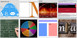
Image
For most web pages and blogs "content is king" (Bill Gates c. 1996) and in addition to text, content should include images, photos and infographics. I would go so far as to say that images/graphics are even more important now than they were 12 months ago. Just look at the new web apps and design views that are turning up. Thumbnails are the  plat du jour  - mobile phone apps and tablet layouts are navigated using images and thumbnails. So to have an appropriate image or graphic for each web page or article is essential. graphic thumbnails from the web devil blog Great looking graphics will also attract viewers and keep them coming back for more visual feasts. The last thing people want is to wade through paragraphs of text without a visual break. And as the famous saying goes " a picture says a thousand words ". Other benefits of images are in searchability. The number of image searches (google images, flickr etc.) is increasing substantially and relevant...

Mobile web design viewport size vs screen resolution - viewport META tag

Image
In a previous post I mentioned the various screen resolutions of popular mobile phones. Today I'll mention how the screen size and viewport may be different! So, what is a viewport? The viewport for web design is defined as the rectangular area (measured in pixels) that is viewable on the screen and determines how the content is laid out and where text wraps or windows need to be scrolled to see the full webpage. Isn't the viewport the same as the screen resolution? For most devices the screen resolution/display size is equal to the viewport. This is true of desktop and laptop computers, however  for mobile devices this may not be true !! Many phone browsers scale web pages down to a wider viewport width to fit them onto the screen. This is sometimes called overview mode. These browsers allow the user to zoom in and scale the pages up to view the bit they want to see. For example, although a device screen might have a width of 320px the viewport can have a width of 980p...